Header Menus

This article describes how to configure the header’s menus.

The main is taken as the header’s menus set identifier.

Header Menu Entry Params

ParameterTypeDescription
headerstringThe header of dropdown menus, available on top level menu only.
dividerbooleanShow the divider if true, see the Dividers below.
descriptionstringThe description for sub menus only, default to page description.
columnsnumberThe column count of sub menus, up to 2, default to 1 when the number of menus is less than 6, otherwise 2.
iconobjectThe icon parameters.
icon.vendorstringThe icon’s vendor, required.
icon.namestringThe icon’s name, required.
icon.colorstringThe icon’s color.
icon.classNamestringThe icon’s CSS class name.
targetstringThe link target attribute.
relstringThe link rel attribute.

See also Menus Configuration and Icons Configuration.

Dividers

Top Level Menus Dividers

If the divider parameter is set as true for top level menu entries, then the current menu entry will become a divider entry, which won’t show text and link.

You have to specify name or identifier for dividers to unique each divider.

Second Level Menus Dividers

If second level menu entries’s divider parameter is enabled, then the divider will be append to the end of the menu.

Example
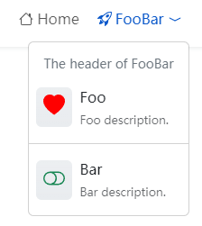
Header’s Menus Example

menus.toml

 1[[main]]
 2  name = 'Home'
 3  url = '/'
 4  weight = 1
 5  [main.params]
 6    [main.params.icon]
 7      name = 'house'
 8      vendor = 'bootstrap'
 9[[main]]
10  identifier = 'foobar'
11  name = 'FooBar'
12  [main.params]
13    header = 'The header of FooBar'
14    [main.params.icon]
15      name = 'rocket-takeoff'
16      vendor = 'bootstrap'
17[[main]]
18  name = 'Foo'
19  parent = 'foobar'
20  url = '#foo'
21  weight = 1
22  [main.params]
23    description = 'Foo description.'
24    [main.params.icon]
25      color = 'red'
26      name = 'heart-fill'
27      vendor = 'bootstrap'
28[[main]]
29  parent = 'foobar'
30  weight = 2
31  [main.params]
32    divider = true
33[[main]]
34  name = 'Bar'
35  parent = 'foobar'
36  url = '#bar'
37  weight = 3
38  [main.params]
39    description = 'Bar description.'
40    [main.params.icon]
41      color = '#198754'
42      name = 'toggle-off'
43      vendor = 'bootstrap'

menus.yaml

 1main:
 2- name: Home
 3  params:
 4    icon:
 5      name: house
 6      vendor: bootstrap
 7  url: /
 8  weight: 1
 9- identifier: foobar
10  name: FooBar
11  params:
12    header: The header of FooBar
13    icon:
14      name: rocket-takeoff
15      vendor: bootstrap
16- name: Foo
17  params:
18    description: Foo description.
19    icon:
20      color: red
21      name: heart-fill
22      vendor: bootstrap
23  parent: foobar
24  url: '#foo'
25  weight: 1
26- params:
27    divider: true
28  parent: foobar
29  weight: 2
30- name: Bar
31  params:
32    description: Bar description.
33    icon:
34      color: '#198754'
35      name: toggle-off
36      vendor: bootstrap
37  parent: foobar
38  url: '#bar'
39  weight: 3

menus.json

 1{
 2   "main": [
 3      {
 4         "name": "Home",
 5         "params": {
 6            "icon": {
 7               "name": "house",
 8               "vendor": "bootstrap"
 9            }
10         },
11         "url": "/",
12         "weight": 1
13      },
14      {
15         "identifier": "foobar",
16         "name": "FooBar",
17         "params": {
18            "header": "The header of FooBar",
19            "icon": {
20               "name": "rocket-takeoff",
21               "vendor": "bootstrap"
22            }
23         }
24      },
25      {
26         "name": "Foo",
27         "params": {
28            "description": "Foo description.",
29            "icon": {
30               "color": "red",
31               "name": "heart-fill",
32               "vendor": "bootstrap"
33            }
34         },
35         "parent": "foobar",
36         "url": "#foo",
37         "weight": 1
38      },
39      {
40         "params": {
41            "divider": true
42         },
43         "parent": "foobar",
44         "weight": 2
45      },
46      {
47         "name": "Bar",
48         "params": {
49            "description": "Bar description.",
50            "icon": {
51               "color": "#198754",
52               "name": "toggle-off",
53               "vendor": "bootstrap"
54            }
55         },
56         "parent": "foobar",
57         "url": "#bar",
58         "weight": 3
59      }
60   ]
61}

The example above use the Bootstrap icons, you can use other icons vendors, such as Font Awesome, Feather, Tabler, Simple icons and so on.

razonyang
Sunday, November 3, 2024 Friday, February 17, 2023